> Hunter Douglas Stores
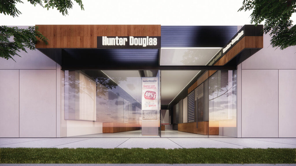
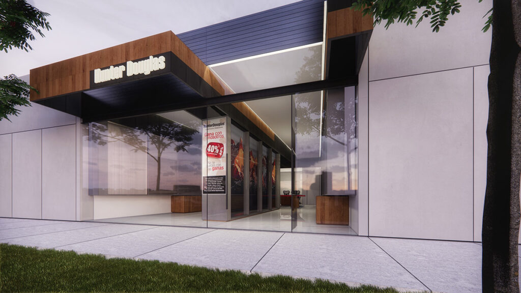
The project, in collaboration with Estudio Lamela, involves the design and development of the Hunter Douglas store prototype. The architectural design prioritizes brand image, employing a contemporary aesthetic and using the company’s own materials, with the idea that the store itself serves as a showcase for the application of its products.
The main façade features a clean-lined structure and a wooden volume that frames the entrance, emphasizing access. The use of glass on the façade allows for complete transparency, providing visibility into the store and enhancing the visual connection between the exterior and interior spaces.
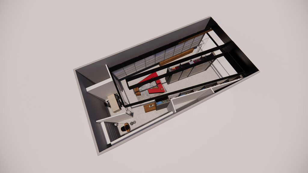
The interior of the store was designed to offer customers a clear and fluid path. The goal was to maximize the user experience with well-defined display areas, where Hunter Douglas products are presented in an organized and appealing manner. Neutral-toned finishes and furnishings create a professional environment, ideal for welcoming visitors and facilitating interaction with the products. The internal layout has been optimized to include display areas, customer service spaces, and administrative offices.


